The Evolution of Icon Design
During my recent research endeavors, I came across a rather interesting site – www.historyoficons.com. I found it to be interesting, not only in its icon design and functionality but also for the content. It takes you on a walk through design history and examines icons from the ‘80s through to today. I couldn’t stop scrolling and was fascinated by the subtle visual progression throughout the years. Plus, there were some user interfaces that I hadn’t come across before.
![]() Being of the GenX generation, it was also a trip down memory lane. I still remember salivating over the sleek, realistic looking icons when OSX came out! I’m sure you could appreciate my excitement after seeing what came before 2001. This was also when the big trend in skeuomorphism took over Apple’s interface and in the process, influenced others in the design field.
Being of the GenX generation, it was also a trip down memory lane. I still remember salivating over the sleek, realistic looking icons when OSX came out! I’m sure you could appreciate my excitement after seeing what came before 2001. This was also when the big trend in skeuomorphism took over Apple’s interface and in the process, influenced others in the design field.
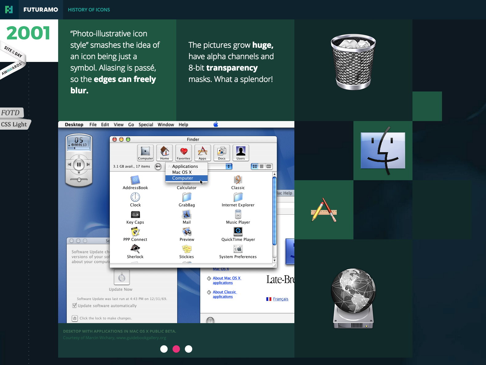 What I found most interesting (and very typical of “design trends”) is the evolution of the trend from its very beginnings, through various modifications, to the end. Like every fad, they tend to come full circle right back to the original idea.
![]()
Granted, our icons today are much sleeker and refined due to changes in taste and technology, but you can see that the initial idea/concept is there. Case in point: less is more.
Sometimes it’s a good idea to reflect on where you’ve been in order to figure out where you’re going. That works for design, as well as in life!
Popup or Popart?
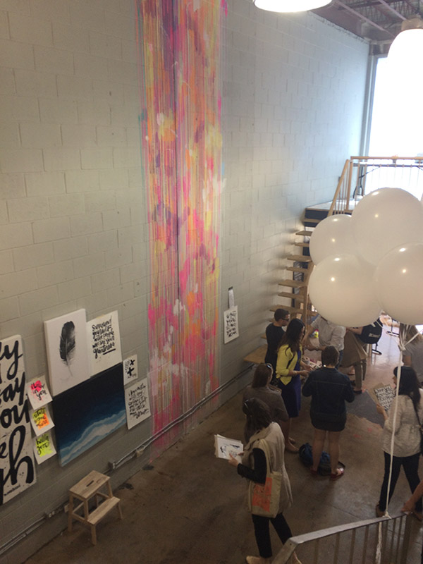
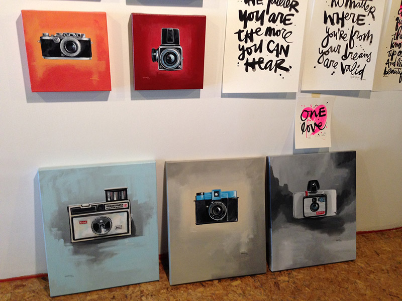
Last Friday was a beautiful day, and when I received an invitation to view a Kal Barteski pop up, my first response was “SURE”, then it was “what is a Kal Barteski popup? A new restaurant?” A quick Google search later and I was hooked! I’ve always loved to paint myself, but to actually see someone from Winnipeg make it as an illustrator is so inspiring. Plus, it was really neat to see the artist in action as she created on the spot requests from customers.
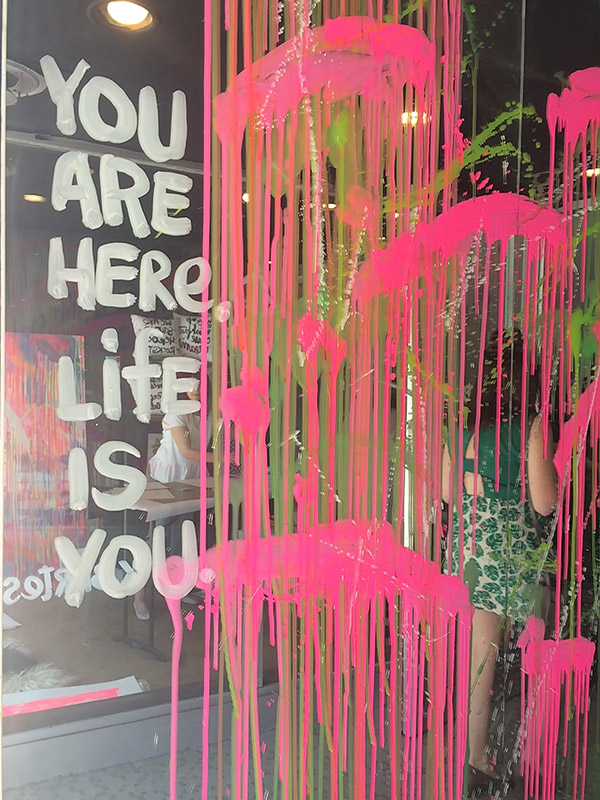
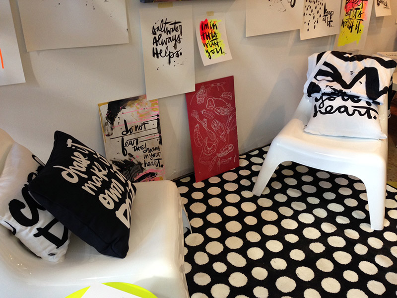
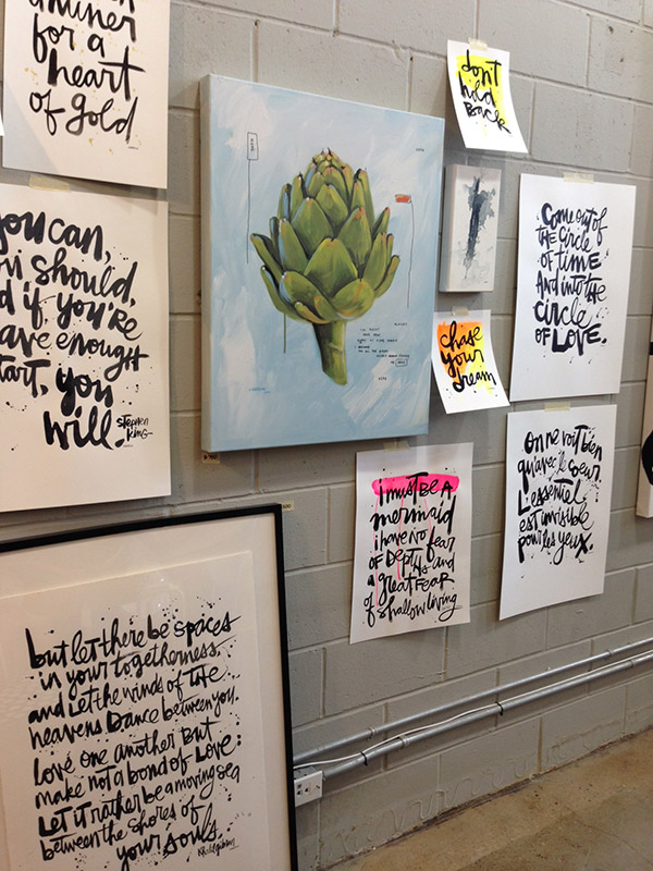
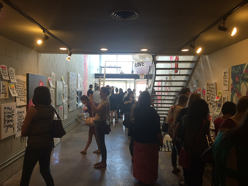
A fun time was had by all, and we walked away more inspired and with a few fridge magnets, postcards, gift tags and small poster prints to beautify our space.
If you’re interested in seeing more of what Kal is up to, you can find her at lovelife.typepad.com
Better get my Pantone book out!
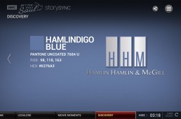
I will freely admit that I love to watch television, but it has to be really good television! Intriguing story lines with great character development are the criteria for choosing what I am going to spend my time watching. Better Call Saul has become a favourite for some of us here at Fusion (me included), and I just had to laugh at last night's episode.
I won't try to spoil it for anyone who hasn't watched the episode yet. I decided to try the Story Sync on my iPad while watching the show. The above image is one that was presented at one point in the show. Basically Saul was accused of copyright infringment when he produced a billboard that was a copycat of a big law firm (note how they even gave their Pantone colour a personalized name!).
What I found interesting was how mainstream Pantone has become in recent years.
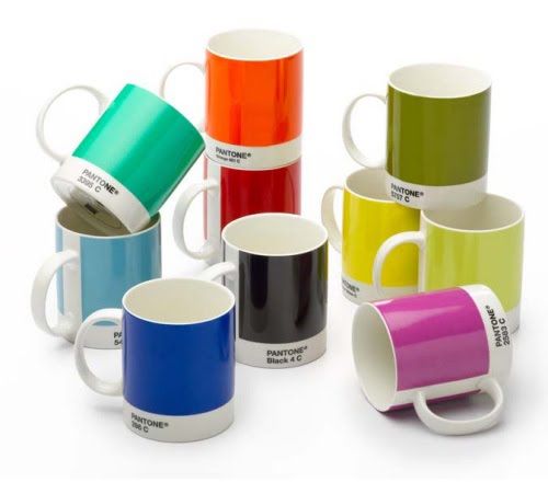
The mugs have been around for a number of years.
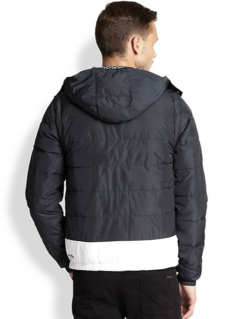
And you can now find a Pantone jacket if you are so inclined.
What used to be (and still is) a hard-working tool for printers and designers, has now become mainstream in our culture. Makes me wonder what will be next?
The Zen of Painting
I love working with watercolour paints - they have sometimes been touted as the hardest medium to work with as it’s difficult to correct mistakes, but I find that it’s those mistakes that can be the most interesting part of the process and usually creates some interest in the image. Working on a computer all day can be fun, but I really love watching paint, water and paper mix together to create beautiful images. This is how I like to spend some of my time after work and find it can fuel the creative process.
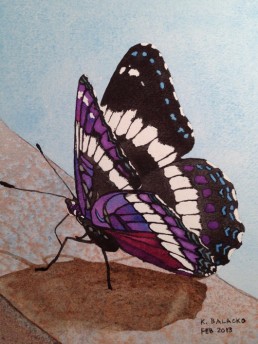
Recently, my 9 year-old niece asked that I paint her a picture for her birthday, and that I could choose any subject matter. I knew she liked butterflies and found a great reference photo from last summer when a butterfly landed on a deck chair at the lake. I also thought she would be interested in seeing the documented progress of the painting and with the amazing cameras on smartphones these days, it was easy to do!
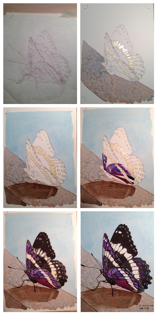
As you can see - there are quite a few stages involved in the creation of the painting, and it can easily become discouraging, but with a little courage and faith, it always works out in the end!