During my recent research endeavors, I came across a rather interesting site – www.historyoficons.com. I found it to be interesting, not only in its icon design and functionality but also for the content. It takes you on a walk through design history and examines icons from the ‘80s through to today. I couldn’t stop scrolling and was fascinated by the subtle visual progression throughout the years. Plus, there were some user interfaces that I hadn’t come across before.
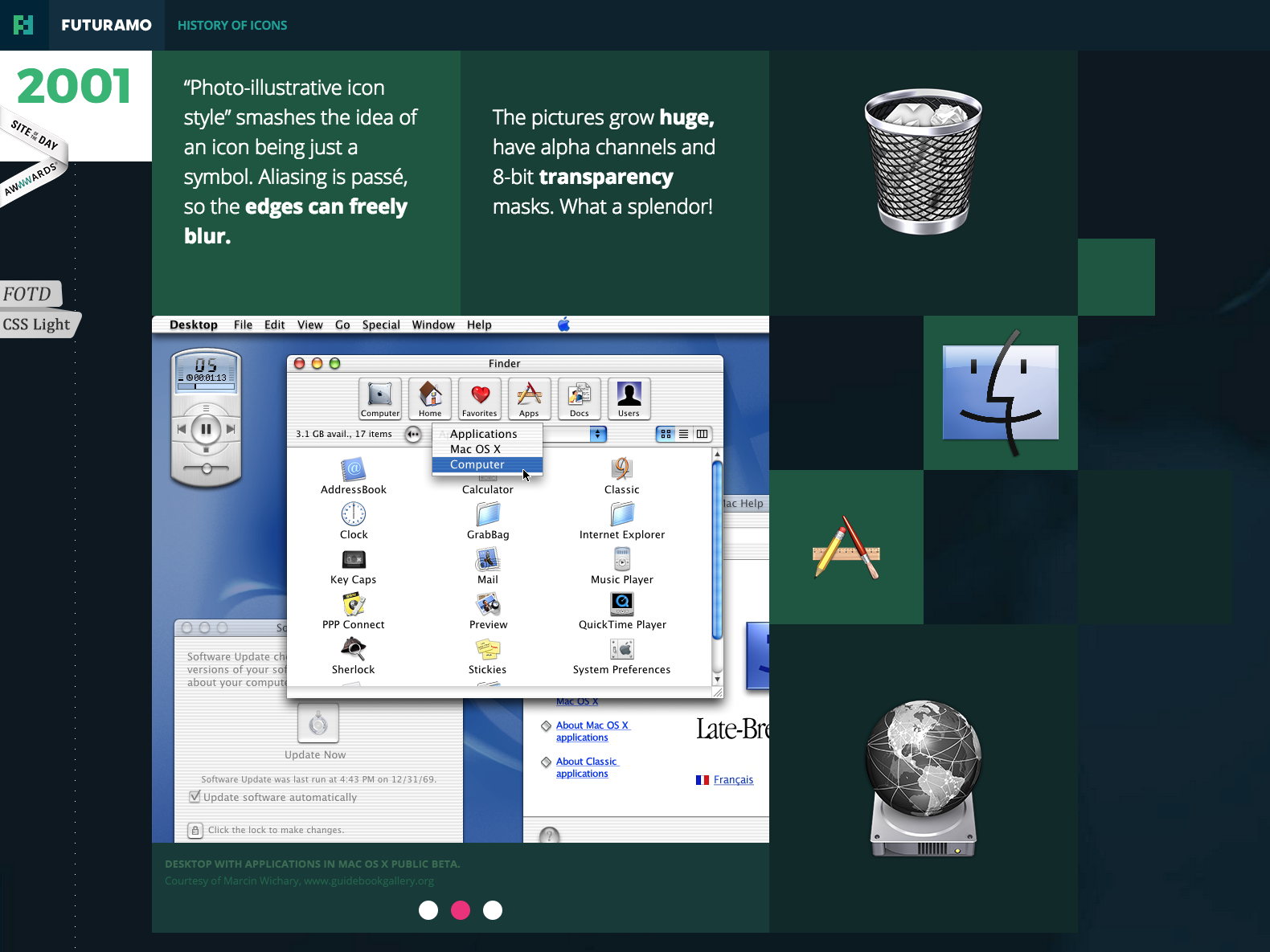
![]() Being of the GenX generation, it was also a trip down memory lane. I still remember salivating over the sleek, realistic looking icons when OSX came out! I’m sure you could appreciate my excitement after seeing what came before 2001. This was also when the big trend in skeuomorphism took over Apple’s interface and in the process, influenced others in the design field.
Being of the GenX generation, it was also a trip down memory lane. I still remember salivating over the sleek, realistic looking icons when OSX came out! I’m sure you could appreciate my excitement after seeing what came before 2001. This was also when the big trend in skeuomorphism took over Apple’s interface and in the process, influenced others in the design field.
 What I found most interesting (and very typical of “design trends”) is the evolution of the trend from its very beginnings, through various modifications, to the end. Like every fad, they tend to come full circle right back to the original idea.
![]()
Granted, our icons today are much sleeker and refined due to changes in taste and technology, but you can see that the initial idea/concept is there. Case in point: less is more.
Sometimes it’s a good idea to reflect on where you’ve been in order to figure out where you’re going. That works for design, as well as in life!